BentoPath
Project Summary
To conduct user research to identify pain points with current product management tools and design a new tool to address those pain points.
My Role
I was involved with most aspects of the project but my primary responsibility was facilitating client meetings, conducting usability tests, and designing mock-ups.
Scope
Timeline: 3-week design sprint
Team: Four people including myself
Format: Desktop
The Design Challenge
Our client for this project was the founder of a digital product design for B2B SaaS & enterprise apps company called Trailmerge. He came to us expressing that his team wasn’t able to utilize the existing product management tools, such as Jira or Asana, in an agile way. With this in mind, he had envisioned an all in one solution product management tool, called BentoPath that would allow for a more agile workflow between departments. He wanted us to conduct user research to highlight potential pain points with current project management tools and to design a tool to solve those pain points.
Time to Get Started
First things first, when working as a team and with a client, you need to have a plan. So my team sat down and created an extensive functional team plan, detailing team roles, communication methods, file organization, frequency of client meetings, and drafting a statement of work.
Research
Feature Inventory
Because no one on my team was particularly familiar with product management software or working in the tech industry our first step was to do some competitive research. We each spent time using Jira and Asana and familiarizing ourselves with the features offered and how one might use them in the workplace.
Doing this helped inform our feature inventory. From this, we found that many other product management tools offered a rich suite of features and options for working in an agile work environment. To get to the root of the issue we’d have to dig a little deeper.
User Interviews
We interviewed 6 product managers varying in age from 35-60. I wasn’t responsible fo conducting the interviews but I sit in on, take notes, and help consolidate research findings. The primary way we did this was via affinity mapping.
Affinity Mapping
I need a way for different teams and departments to view what is pertinent to their team/department.
I need a way to easily collaborate across teams on a release.
I need tools/features that help me plan ahead.
I need a way to easily communicate with my team.
From our affinity map, we found that users were mostly experiencing issues with having to use too many tools to keep things organized and that they wanted a way to provide a broader “at a glance” overview of the different teams and the tasks pertaining to a project.
Results
I used our findings to create a persona. Meet Peter!
Persona
Peter Davis
Name: Peter Davis
Bio: 34 years old, product manager, Atlanta, GA, Married, 2 children
Behaviors: Peter uses multiple tools to track the progress of different departments. He works closely with all departments to manage projects.
Needs: Effective communication with teams as well as a broad overview of the roadmap for different departments.
Goals:
To get an overview of the roadmap and department’s progress.
To move task and cards easily to the release bucket.
Pain Points:
Has to use multiple tools to track and his team’s progress
Needs a tool that allows for a quick overview of all teams and departments.
Scenario: Peter is trying to get an overview of the progress from different departments but he has to use multiple tools (Jira, Slack, Confluence, etc) to see what each team is doing and the progress they’ve made. Trying to balance the different information from different sources is cumbersome ineffective.
Journey Map
As part of our research one of my teammates put together a journey map so that we could better understand Peter’s journey and empathize with his pain points.
The Journey Map helps illustrate the ups and downs that Peter experiences with his product management tools. As you can see it’s not terrible but there’s some room for improvement.
Ideate and Sketch
Now we start to get into the problem-solving stage. Our team drafted some “How might we” questions. This gave us a jumping-off point and helped us to focus on the problem we were solving.
How might we…
Give a broad overview of the progress for the product manager?
Make it easier for the product manager to mark tasks as completed?
Make it easier to move things to release for the development team?
From here we held a design studio so that we could quickly sketch out potential solutions to these questions. This helped us to brainstorm and ultimately inform our final design
Design and Prototype
Wireframes
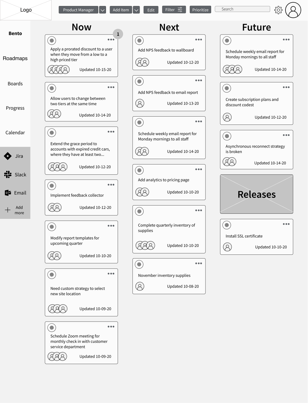
Once we had settled on a design, one of our teammates took lead on the wireframes. We wanted the design to have a simple overall view of the tasks and have them labeled by either urgency or by department. It was also important for us to design a simple way to get more details and to be able to move those tickets into the releases when they were ready to be handed off to the development team. This lead us to a card layout with a release card at the bottom right of the screen. This way the user could easily view and move cards to the releases.
Evaluate Designs
Now that we had our wireframes we made them into a clickable prototype. We used this prototype to conduct our first round of usability testing.
Usability Testing
I took lead in conducting the usability tests. I conducted a moderated test where we gave the user several individual tasks in sequence to see how they interacted with our prototype.
One of the things that users had trouble with was understanding what page they were looking at. To address this we added a title at the top, adjusted the text hierarchy, and added separating lines between each column. This helped the overall layout be more clear and organized.
Something else we noticed is that users didn’t want to have to go to a different screen to access the releases. It took some extra clicks so we adjusted the releases as well, instead of being a box at the bottom right, into a collapsable bar across the bottom of the whole screen. This way the user can see things at a glance while the bar is collapsed or expand it to get more details without having to navigate to a separate screen.
For our second round of usability testing, we wanted to test the same tasks but with our refined design. For our second round I tested for the same tasks, but this time with our hi-fidelity, mocked up prototype. We wanted to use a hi-fidelity prototype to see if users would be influenced or guided by color and a more finalized design.
From our second round of usability testing, we found that users were able to carry out the intended tasks very easily. This helped to validate the design decisions we made from our first round of testing.
Mock Ups/Final Deliverables
Something that was extremely important to us was that we deliver a fleshed-out concept and prototype to our client. To accomplish this we did several things. Firstly we put together a design system. We did this so that our client could have a comprehensive set of assets to continue to use as he continues to work on, and grow BentoPath. This is the abbreviated version of the design system.
We also felt that it was important to incorporate some kind of onboarding for new users. We implemented this with the “Tickets” Page to show what onboarding for BentoPath might look like.
Secondly, we designed several other viewing options. These pages are designed to give different perspectives on the project. The idea is that the information presented would be the same or similar but laid out in different formats to aid in agile work environments.
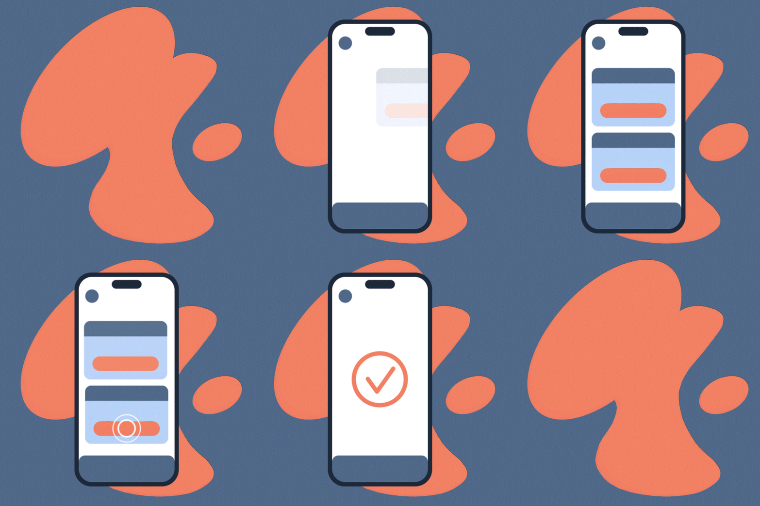
In addition to the other pages all of the users we tested expressed that they would have appreciated drag and drop functionality for organizing the cards or moving them into the releases. Because of limitations, we weren’t able to test this in our prototype but I created an animation to demonstrate how that functionality would work.
And last but not least I created custom illustrated sushi icons for the cards. These were created to hearken back to the name BantoPath. These icons are used to represent different teams or departments. That way the Product manager can see, at a glance, what team is responsible for what card. Also, they’re adorable, so that’s a plus.
Conclusion
This was initially a very challenging project. Our whole team didn’t have any experience with the tools we were evaluating and re-designing, the design prompt was very open-ended, and it seemed like there were already other tools that solved the issues we were trying to solve. Being able to really lean on the UX process was an awesome learning experience for me.
In the end, I’m extremely proud of what our team accomplished in just 3 weeks. I think ultimately our inexperience with product management tools like Jira and Asana proved beneficial. We were able to have an objective view and rely on the UX process to inform our design decisions. I had a blast working on this project and I’m really happy with the end result.
My Animations
KFConsole
Google Keep
About Me
-

KFC - Diablo IV
-

KFConsole
-

Motion Graphics
-

My Art Gallery
-

About Me


